I’m Chris

I help brands tell stories

through creative direction that moves the needle

Selected Work

The current chapter: Tonum, from the inside.

Tonum

Creative Director · In‑house

01 Attention Campaign

King Motus

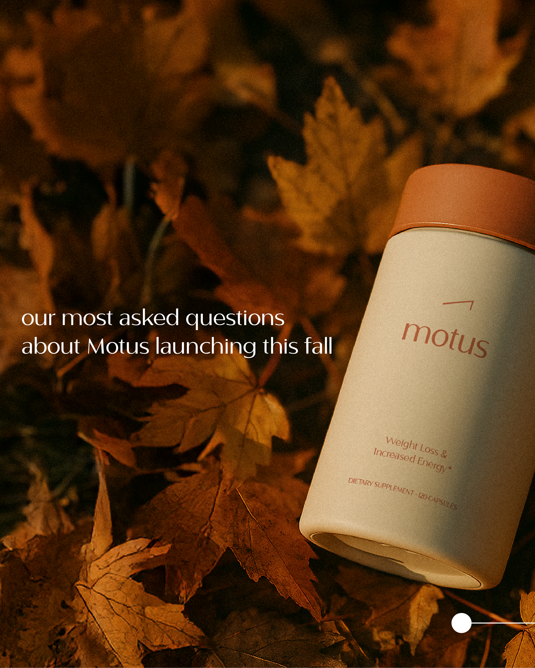
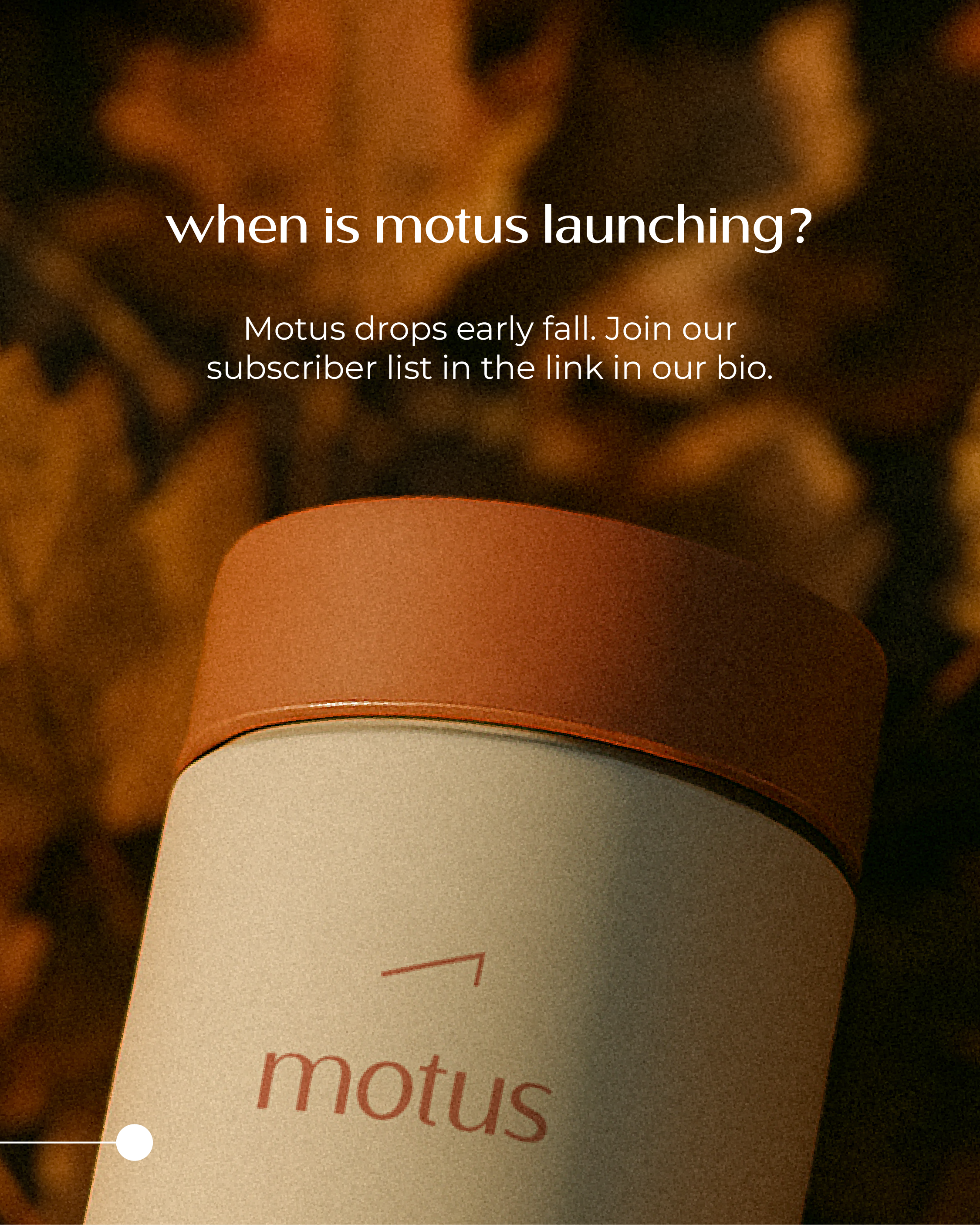
A mythical campaign that turned King Midas into King Motus — and turned a weight-loss supplement into a story people wanted to follow.

Brief

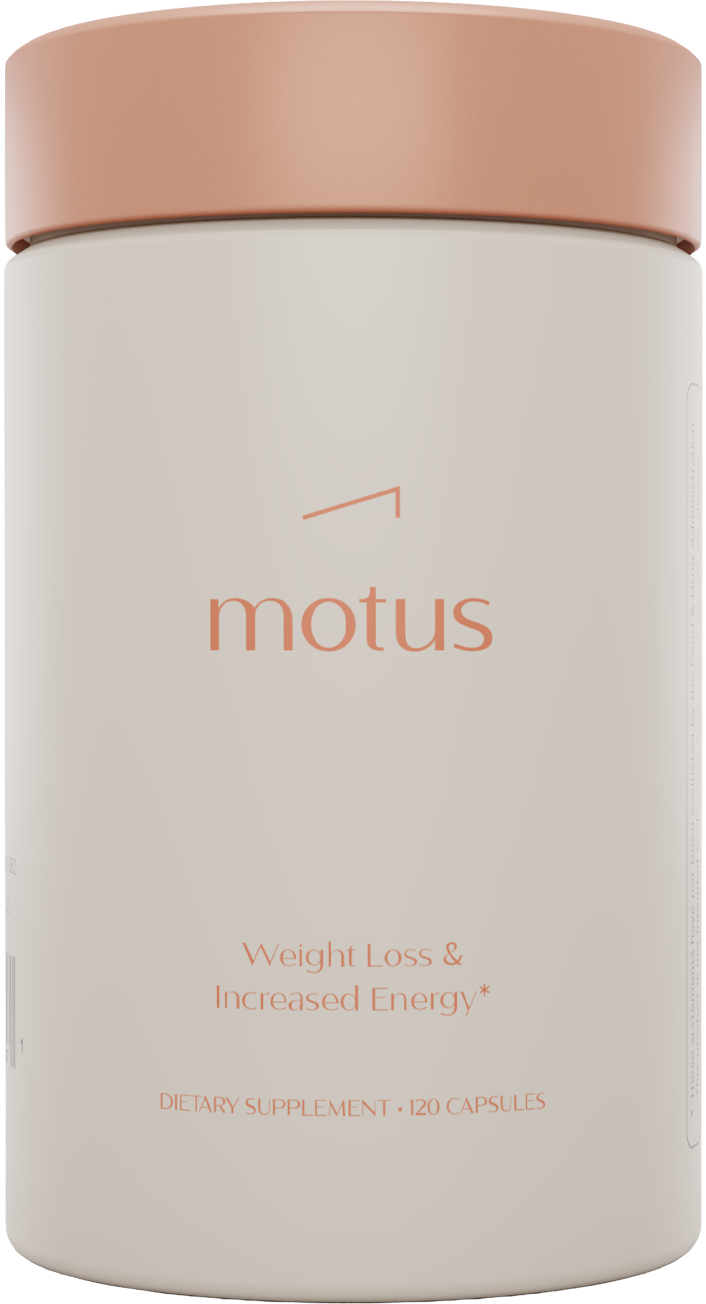
Tonum needed an attention grabbing campaign. The idea arose to use the "Midas Touch" to illustrate the effects that Motus can have with assisting potentials customers on their all-natural weight loss journey.
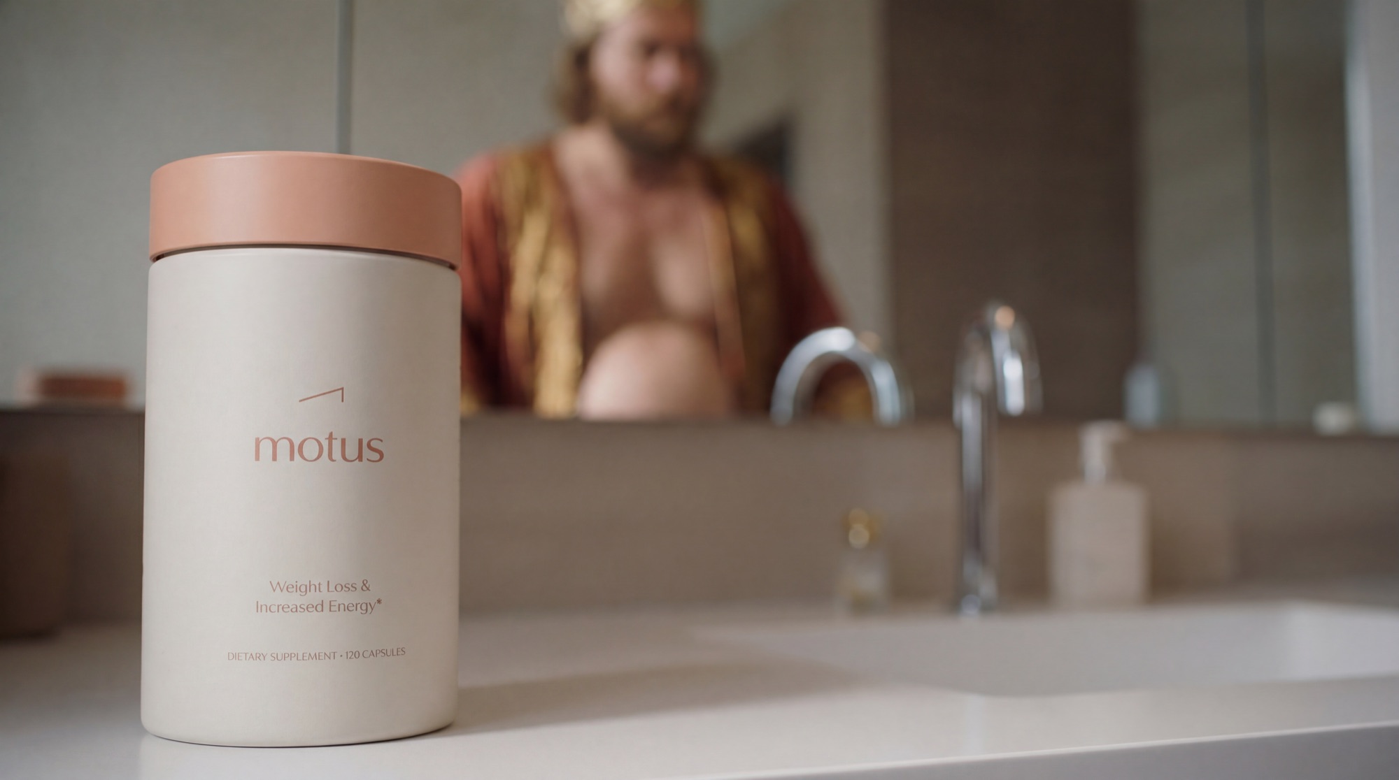
King Motus film still: a Motus supplement bottle on the bathroom counter, with the pre-Motus Midas reflected in the mirror behind.
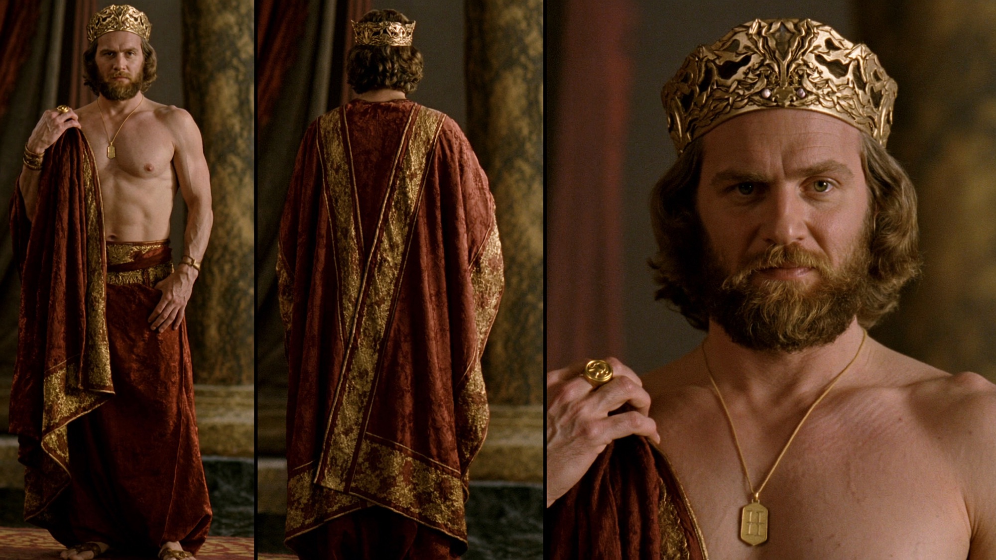
King Midas portrait — the actor in costume, framed for brand mark reference.

Insight

Make the touch — not the product — the story. Everything King Motus touches transforms; let the campaign behave the same way.

King Motus subway poster mockup — out-of-home campaign placement.
King Midas with his court — group still from the King Motus campaign film.

Results

Placeholder for results and recognition.

02 Tonum — Brand Identity

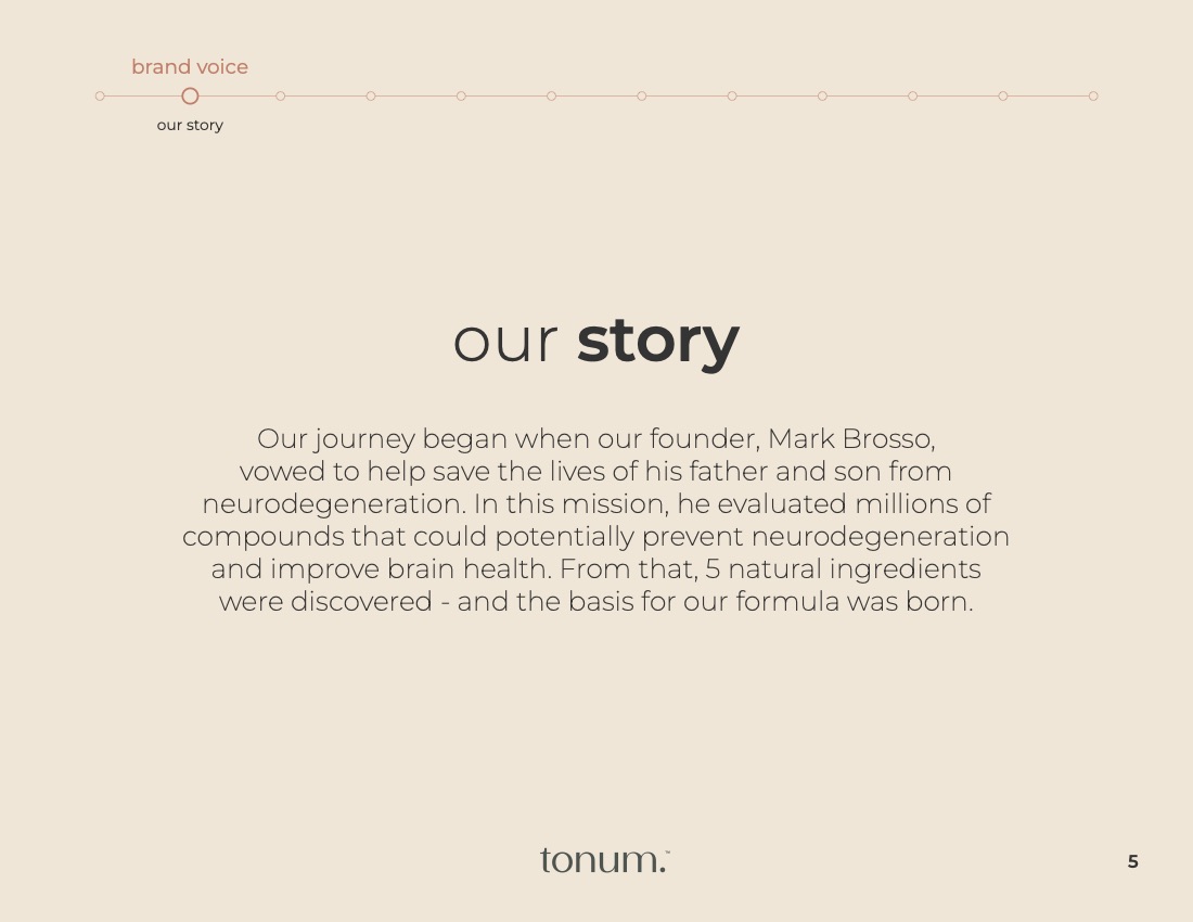
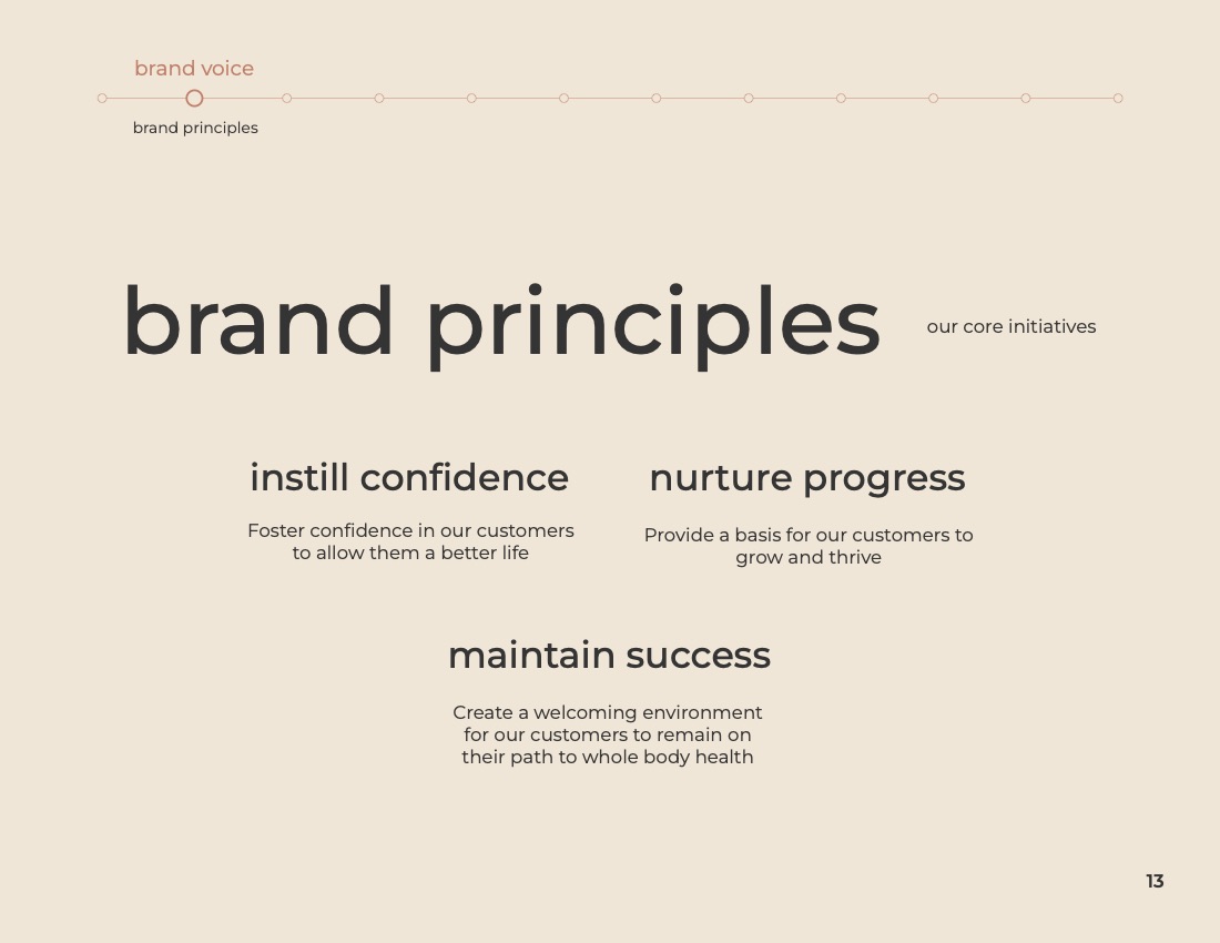
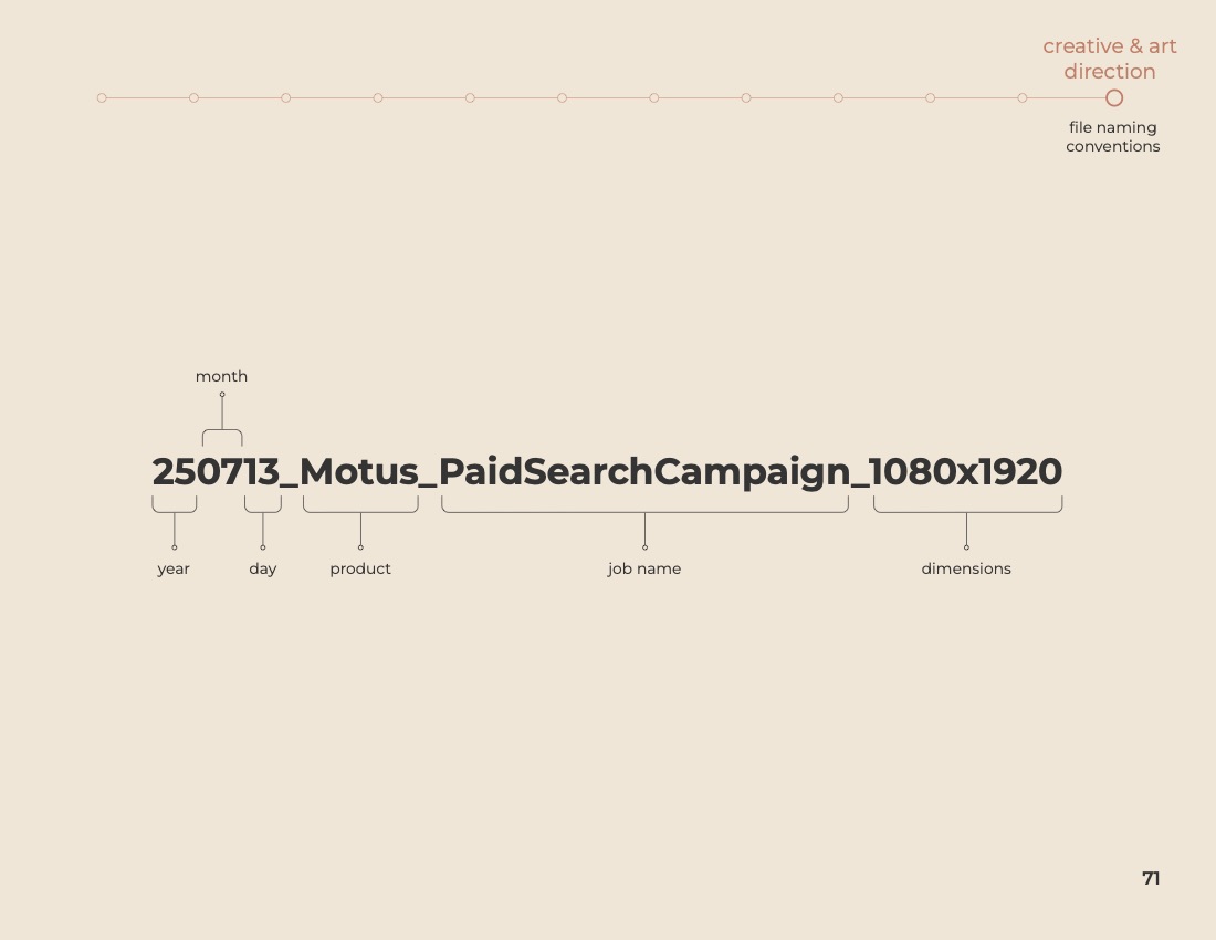
From Prostasis to Tonum

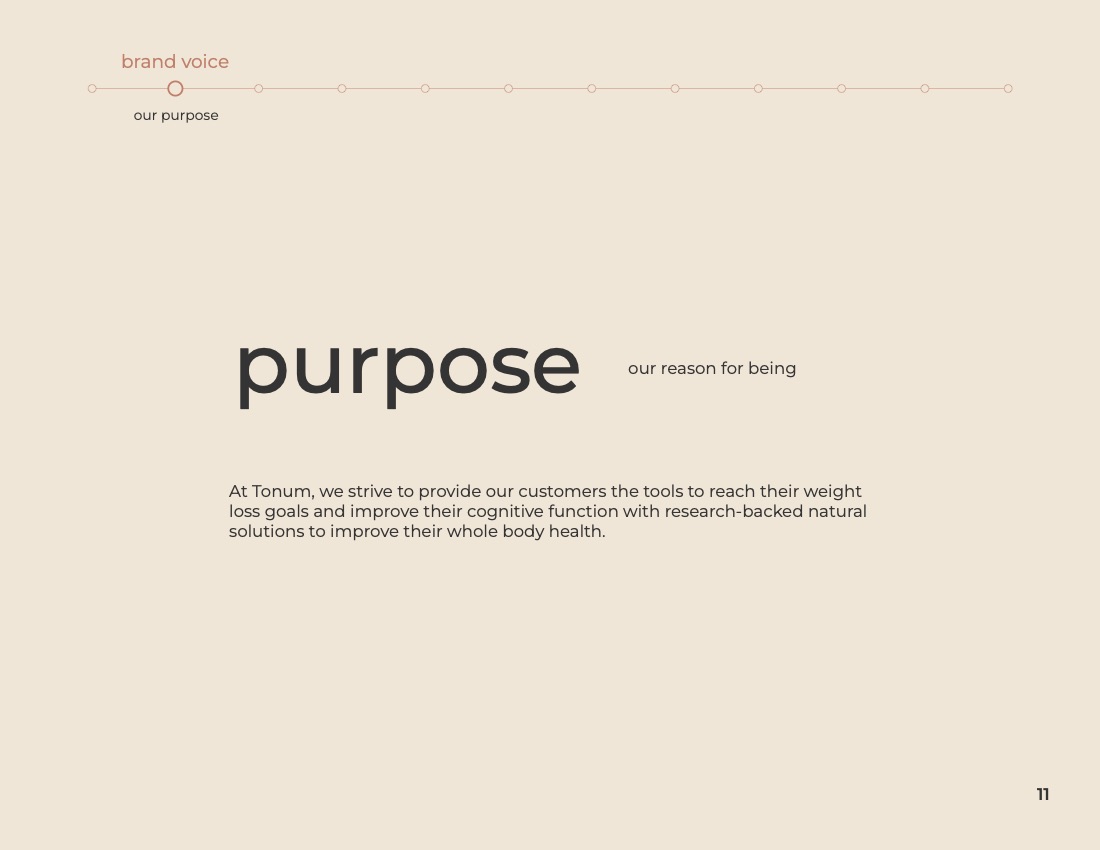
A dated name with an unfortunate medical echo, rebuilt as a premium wellness identity — and a system a twelve-person team runs without me.

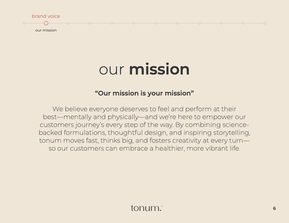
“Every product got a name with Latin roots and a reason to exist.”

Brief

Prostasis had aged out of its own category. The identity was dated, and the name sat close enough to an unrelated medical condition to create hesitation — a real liability for a brand asking people to trust what they put in their body. It needed a new name, a new visual language, and a system built to carry a growing product line.
Prostasis wordmark, the previous identity

Prostasis · 2019–2024

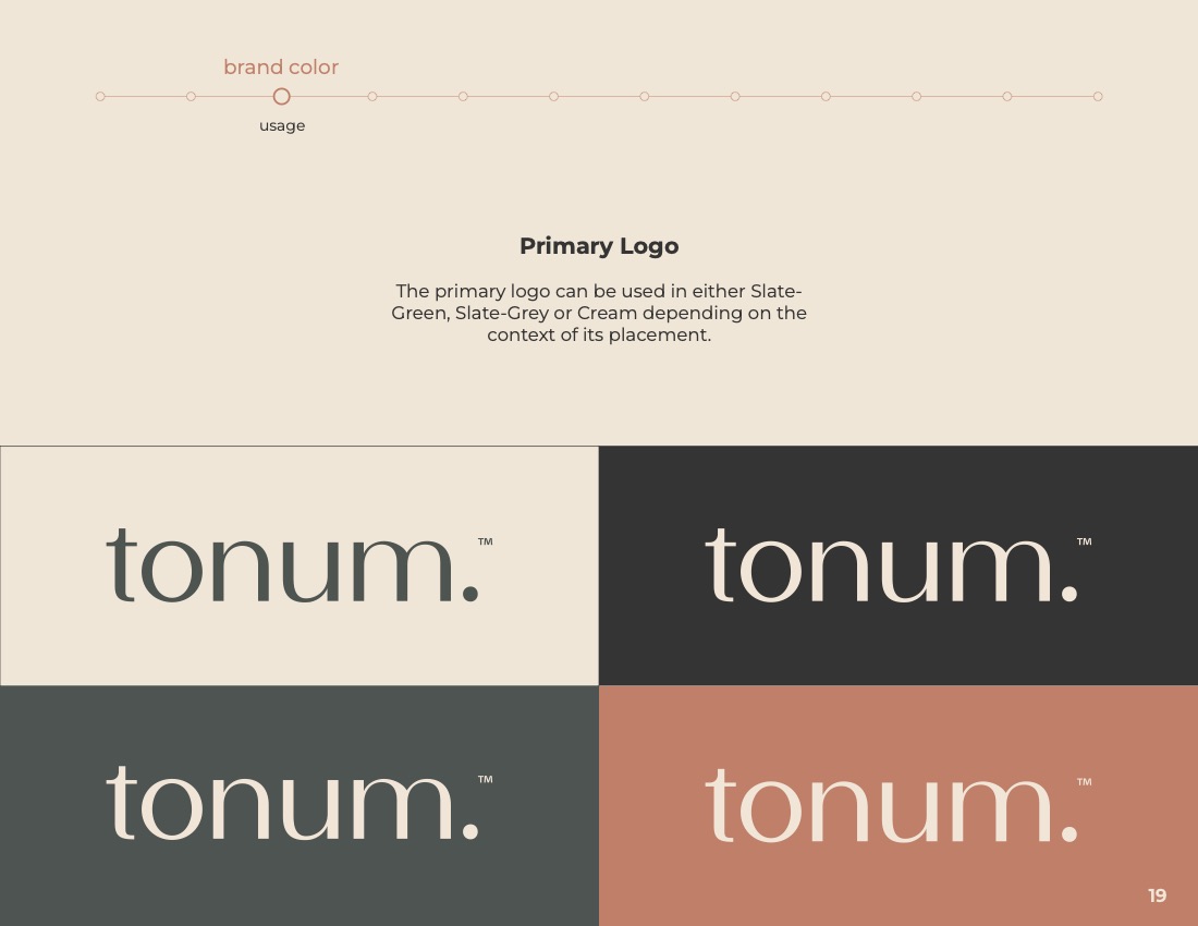
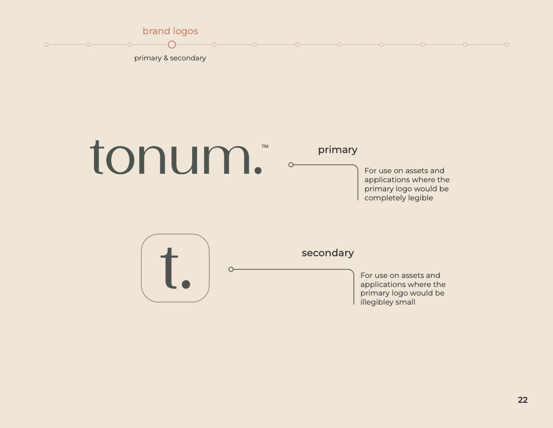
Tonum wordmark, the current identity

Tonum · 2024

The Line

Insight

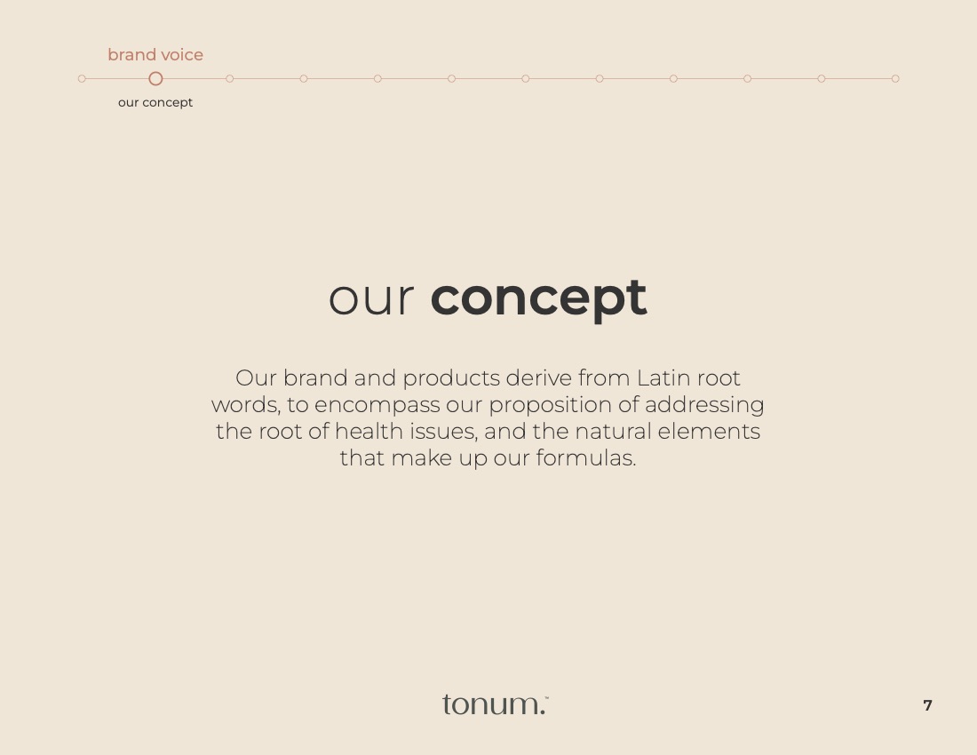
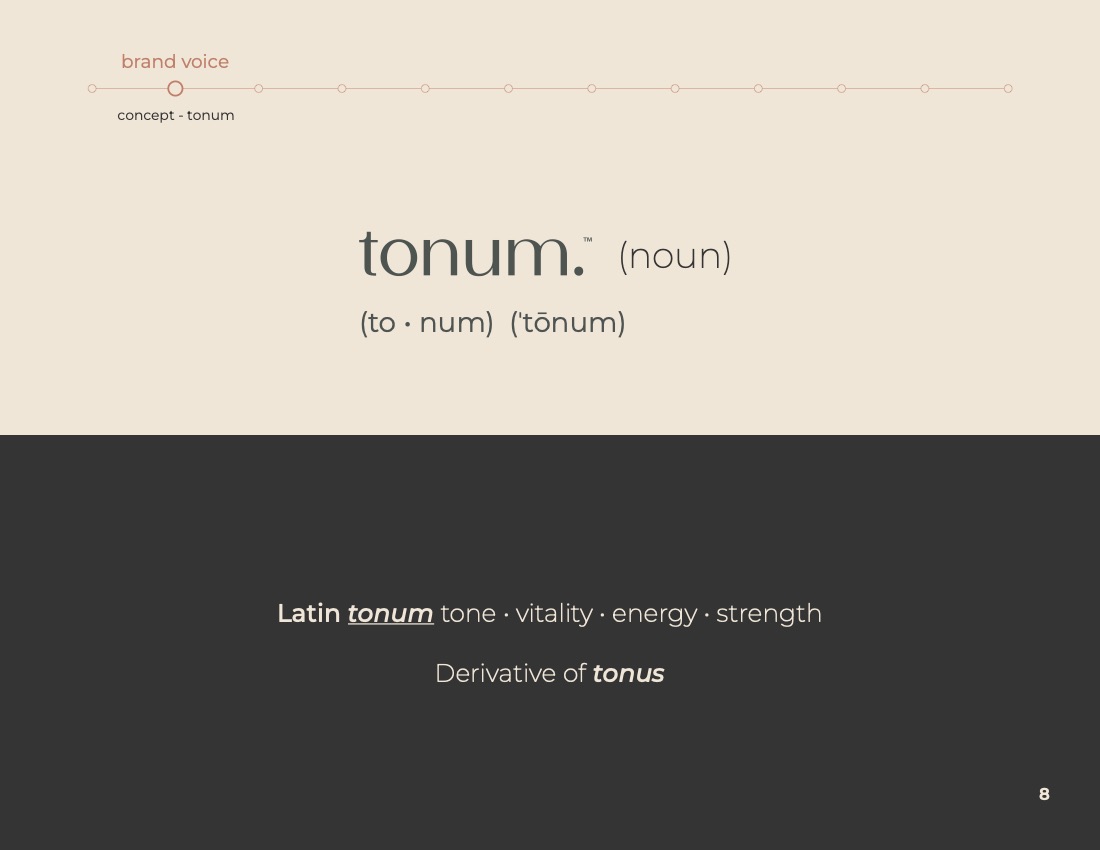
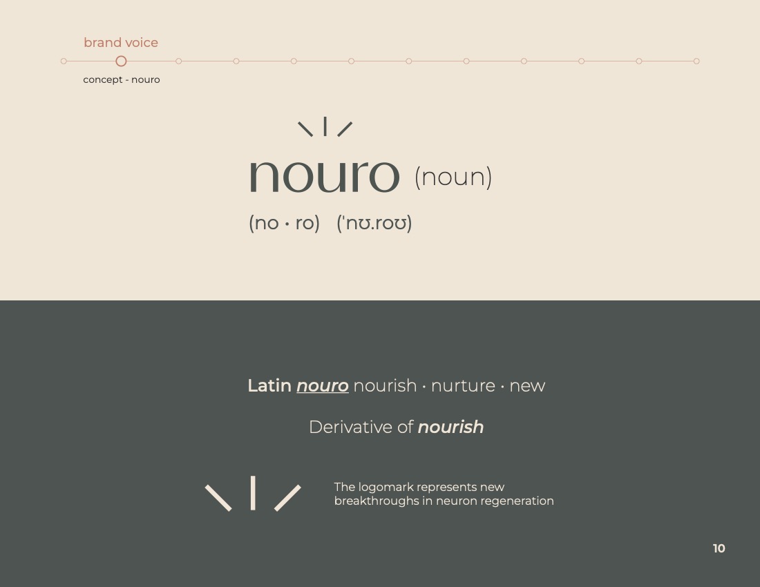
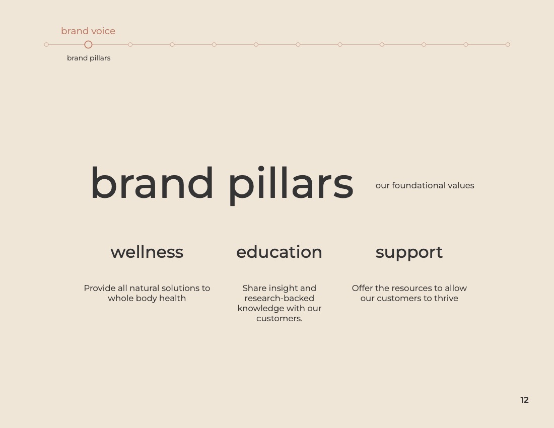
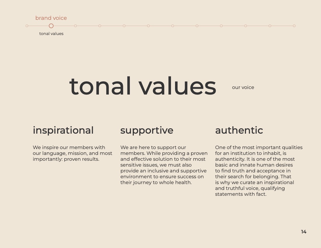
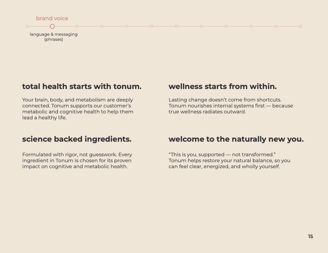
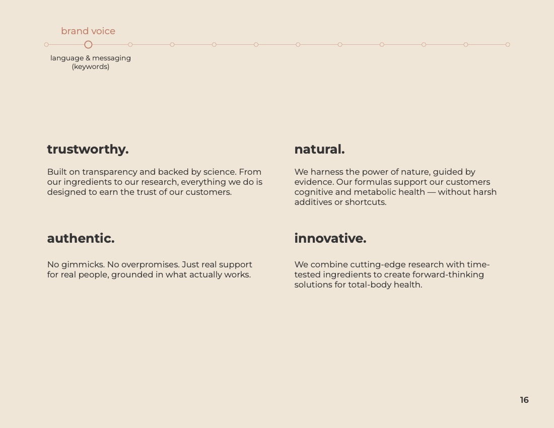
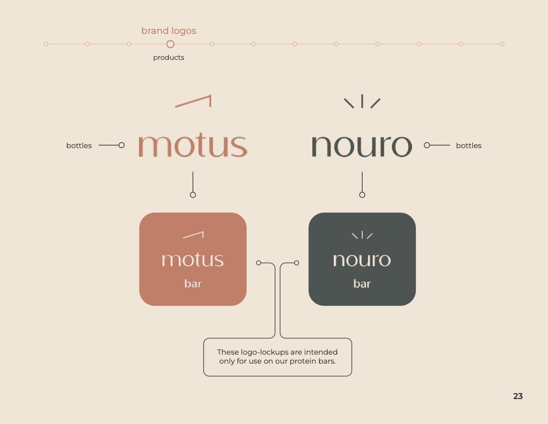
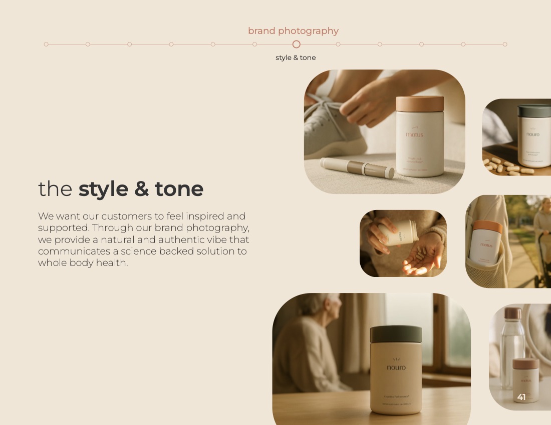
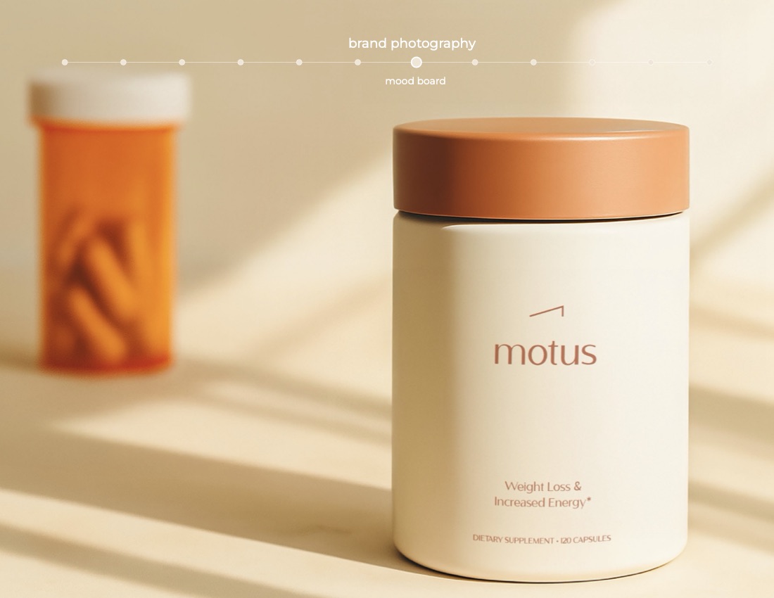
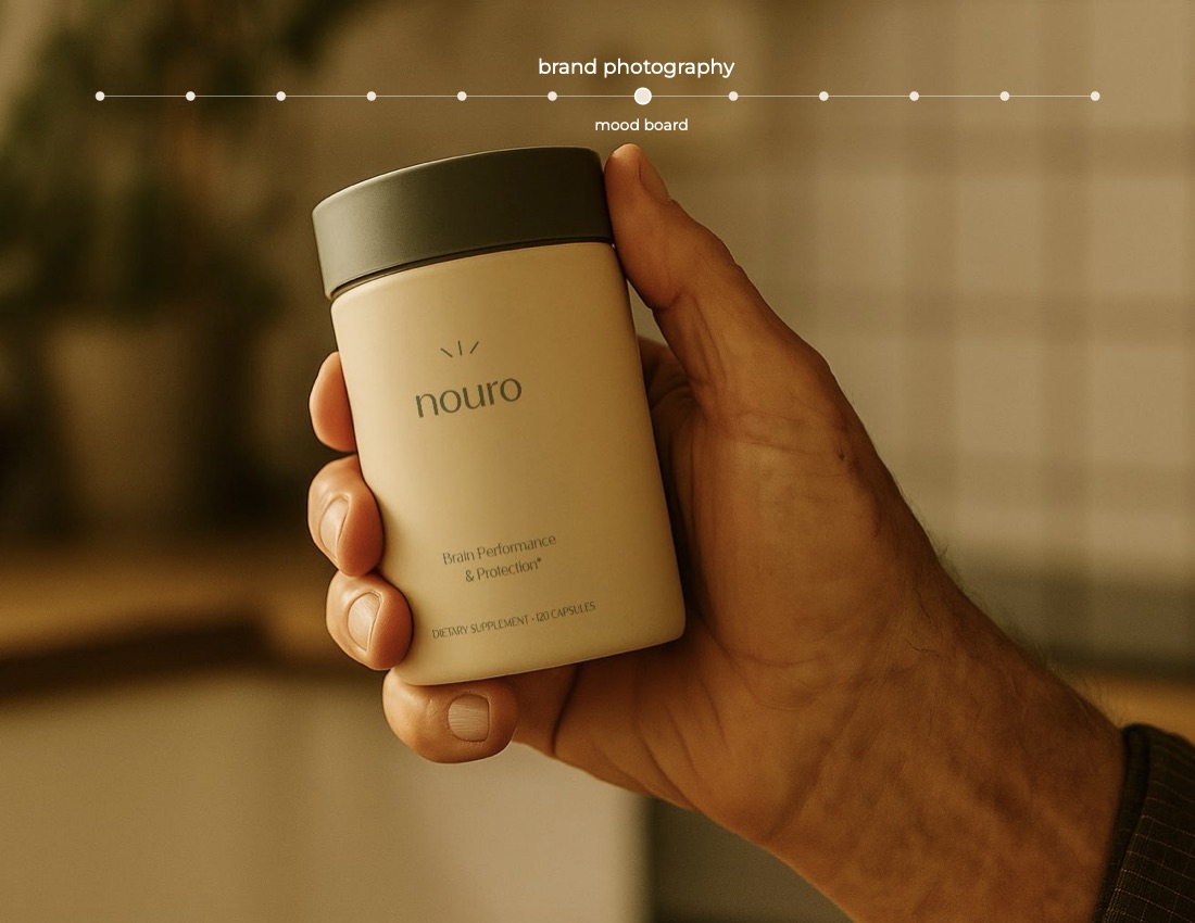
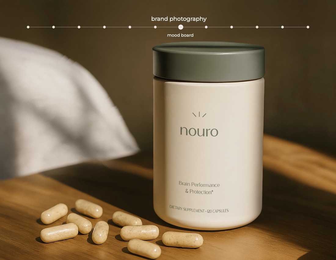
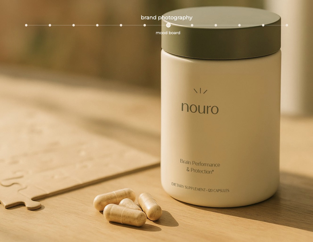
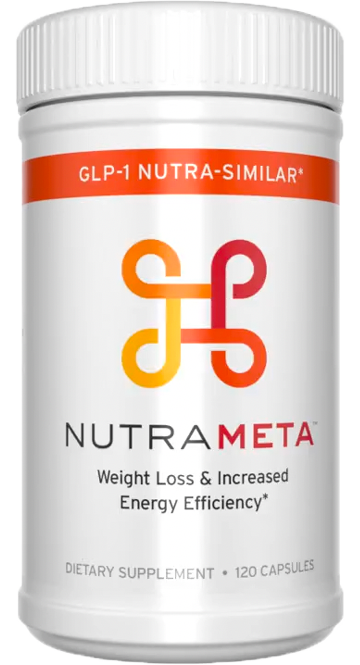
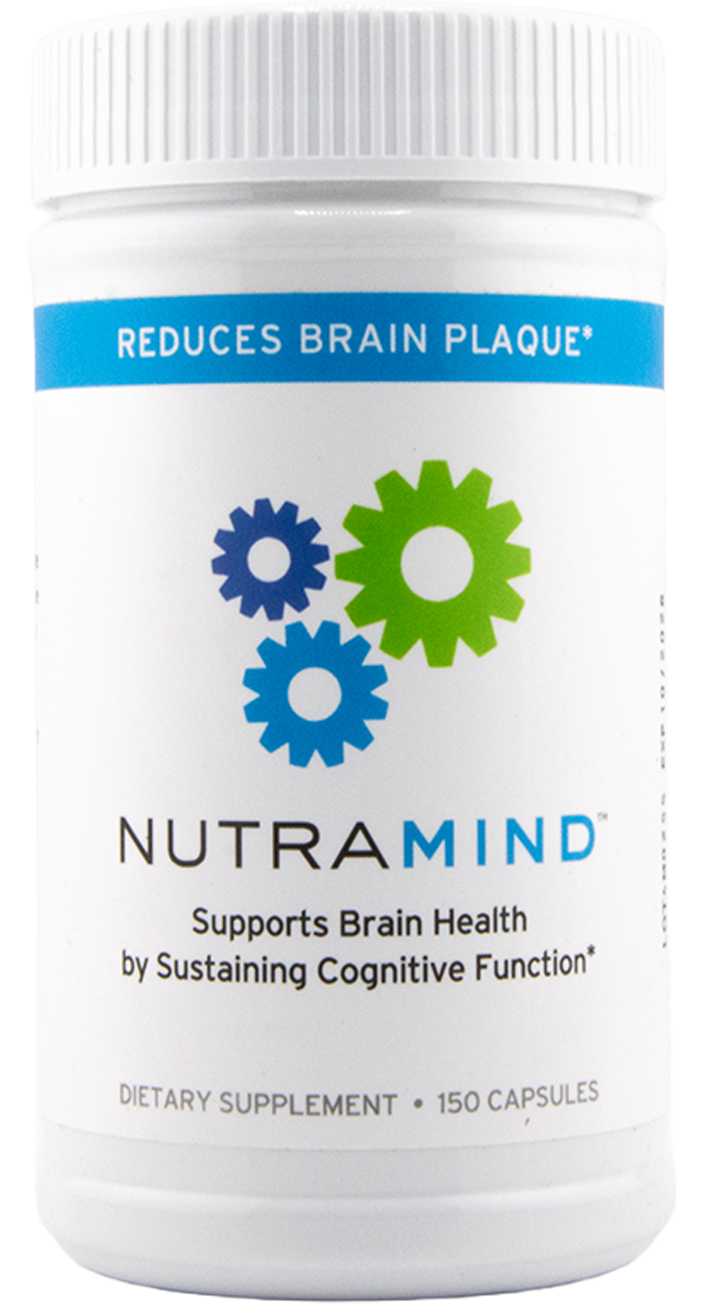
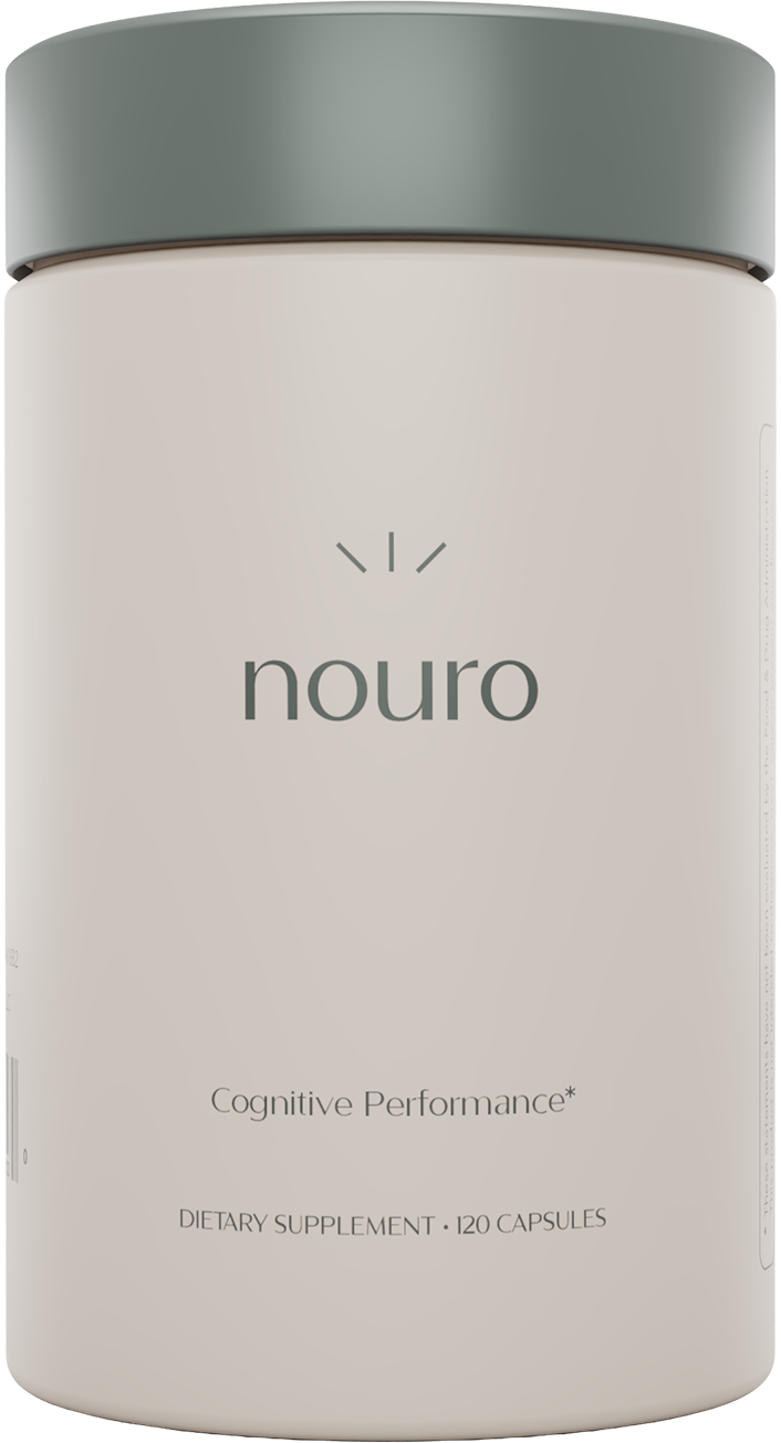
In wellness, trust is communicated through restraint. Instead of the category’s usual volume, we built quiet elegance — minimal, contemporary, confident — and gave every product a name with Latin roots that meant what the product did. Motus for movement. Nouro for the mind. Intention in place of generic assembly.

The System

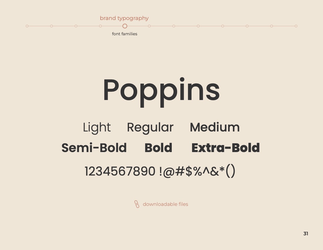
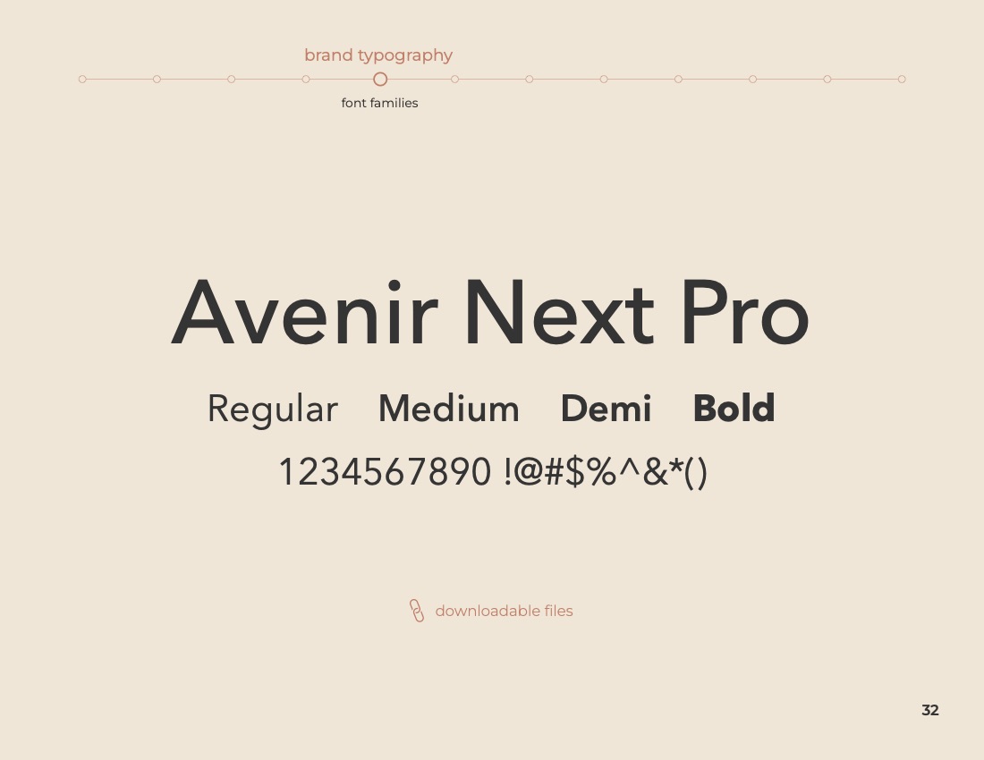
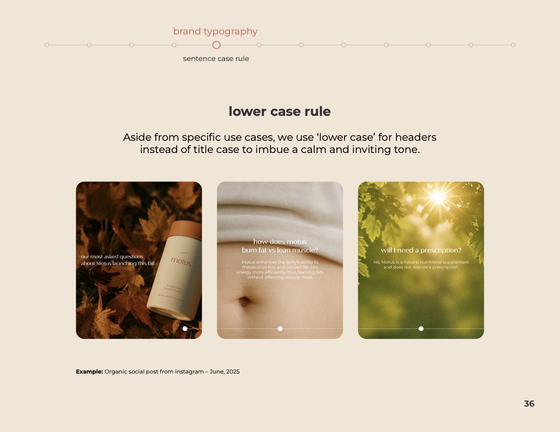
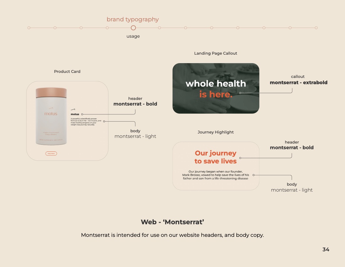
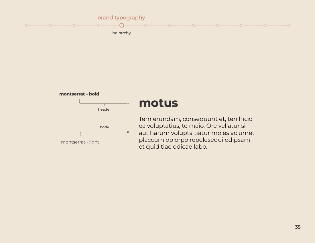
Tonum typography specimen — the Poppins family from light to extra-bold.
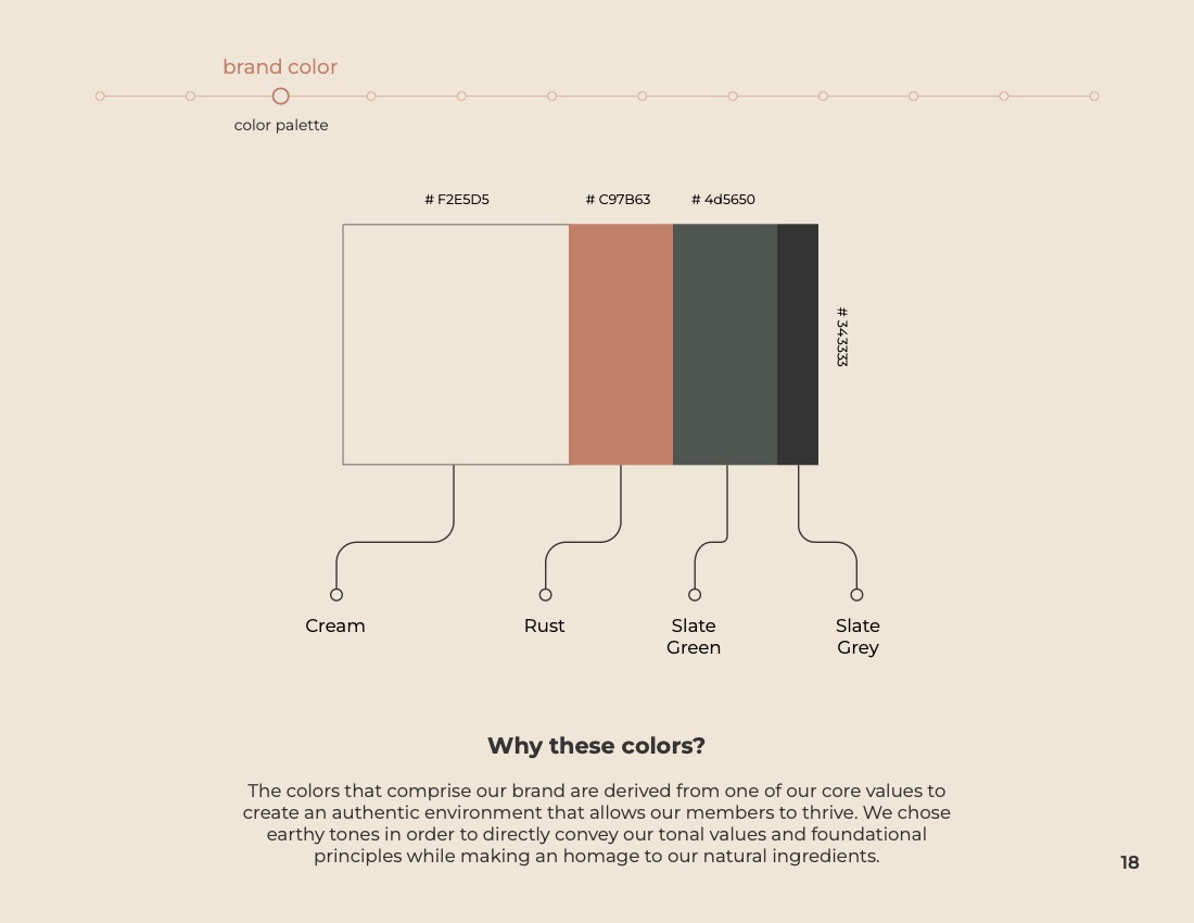
Tonum colour palette — Cream, Rust, Slate Green, and Slate Grey, with the reasoning behind them.
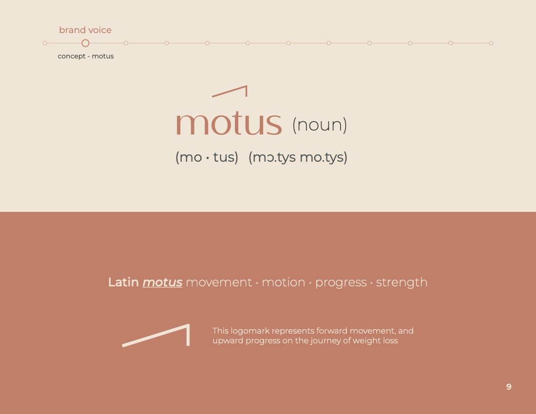
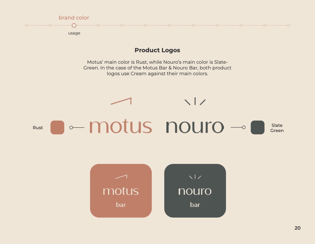
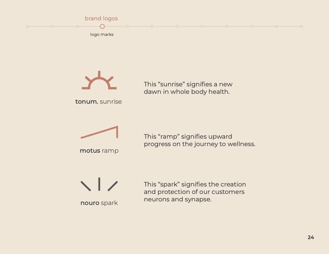
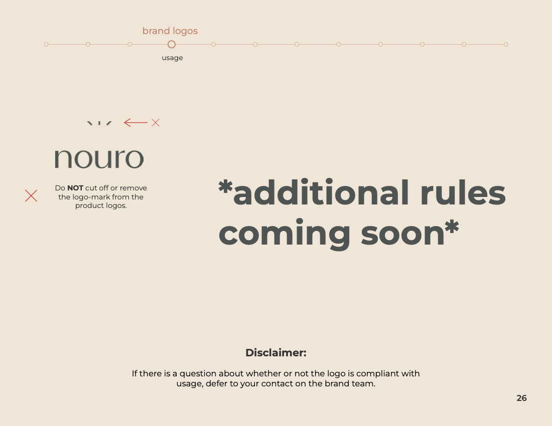
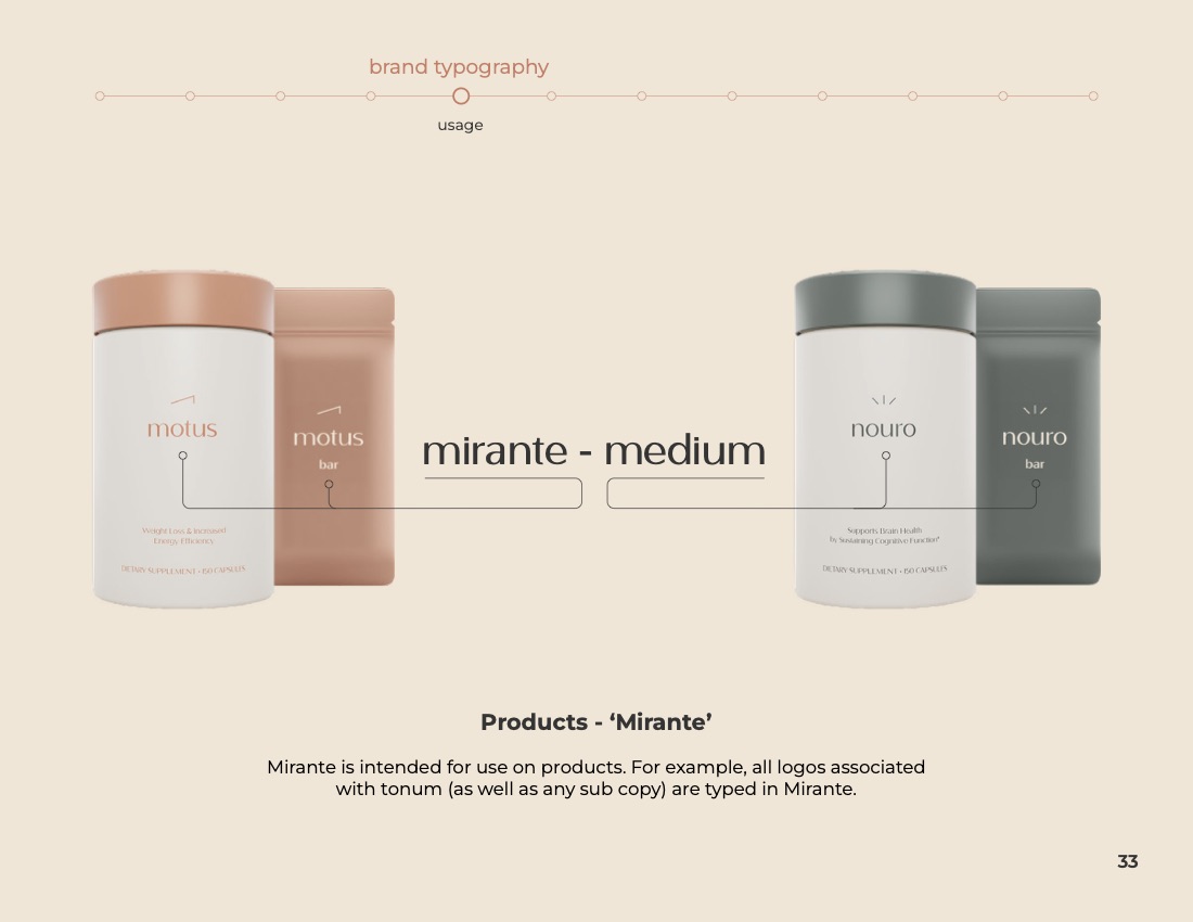
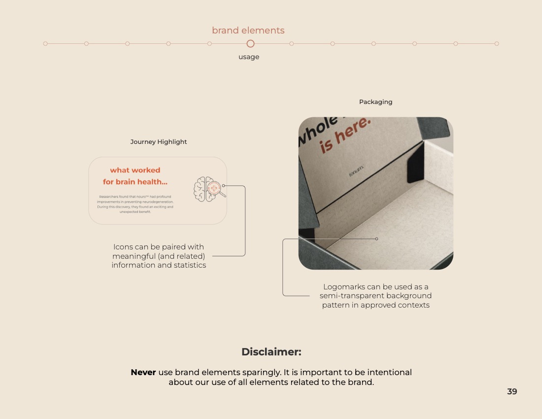
Tonum logo marks — the sunrise, the Motus ramp, and the Nouro spark, each with its meaning.
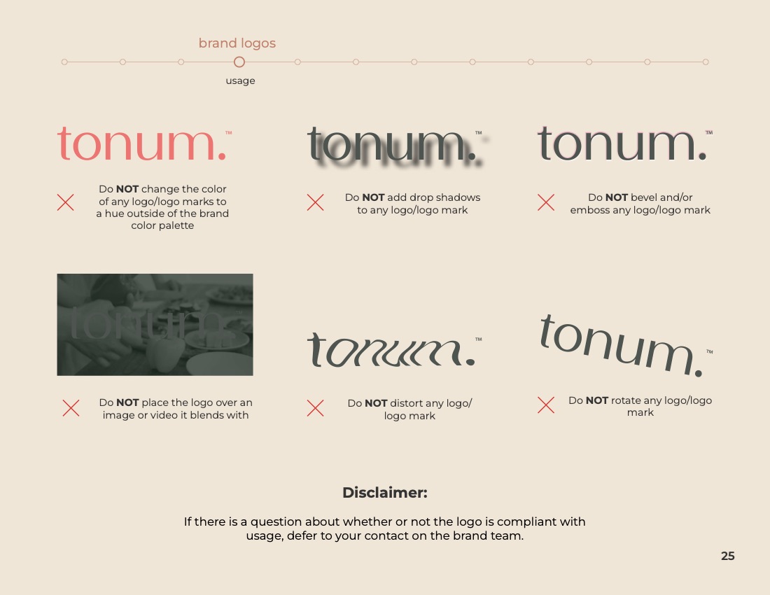
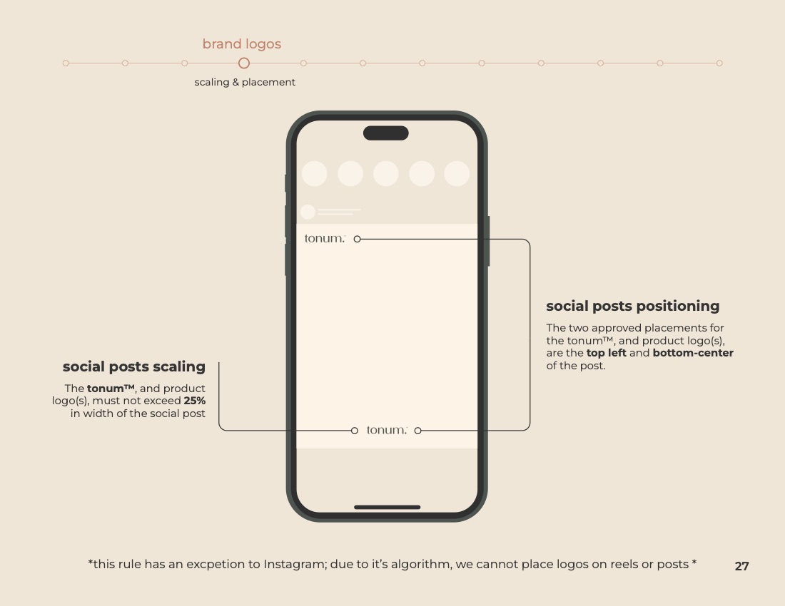
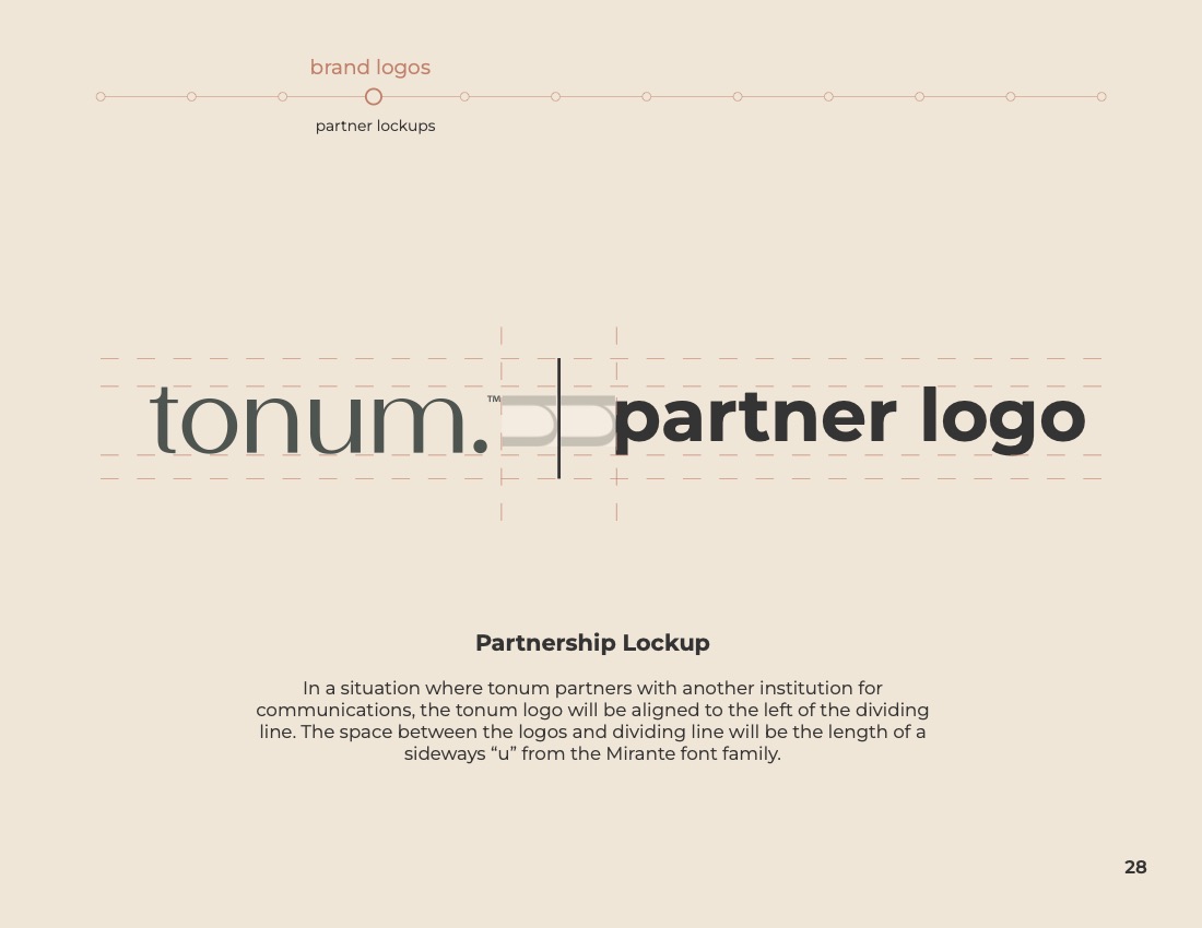
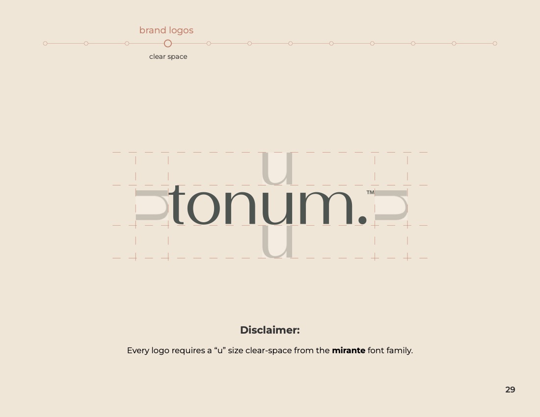
Tonum wordmark clear space construction — a lowercase u of padding on every side.
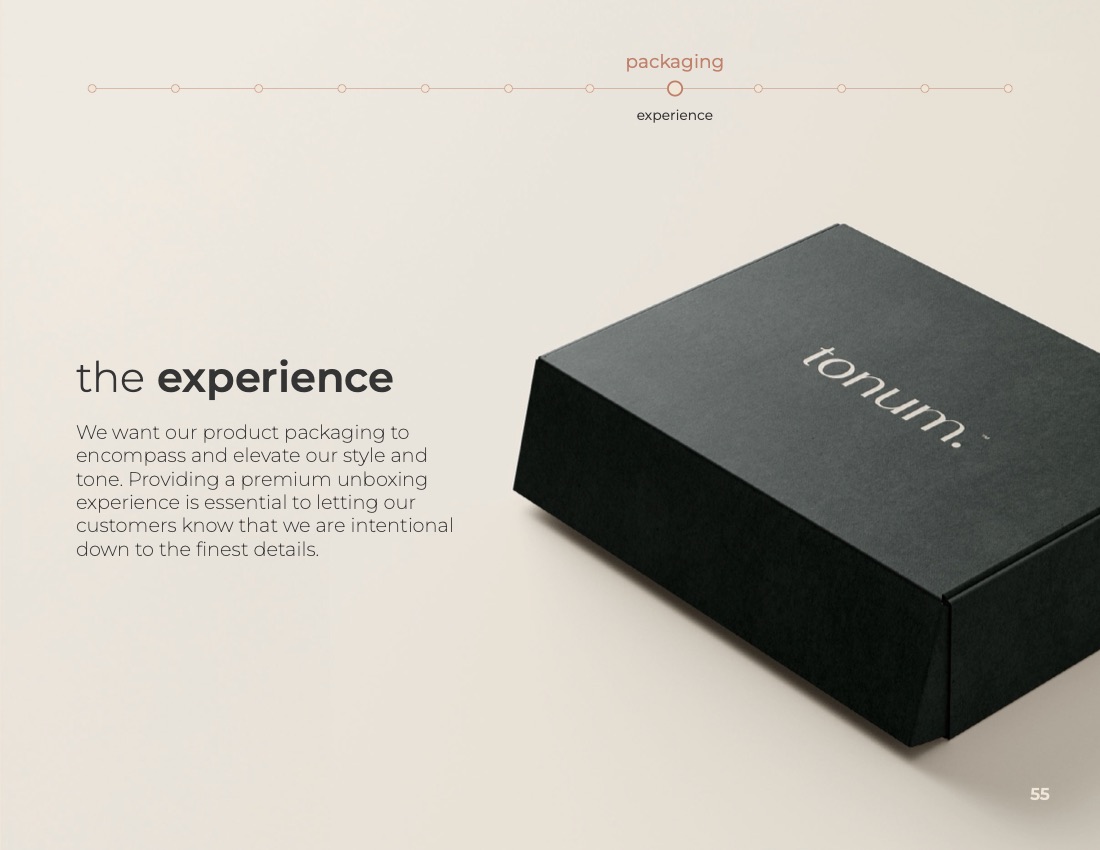
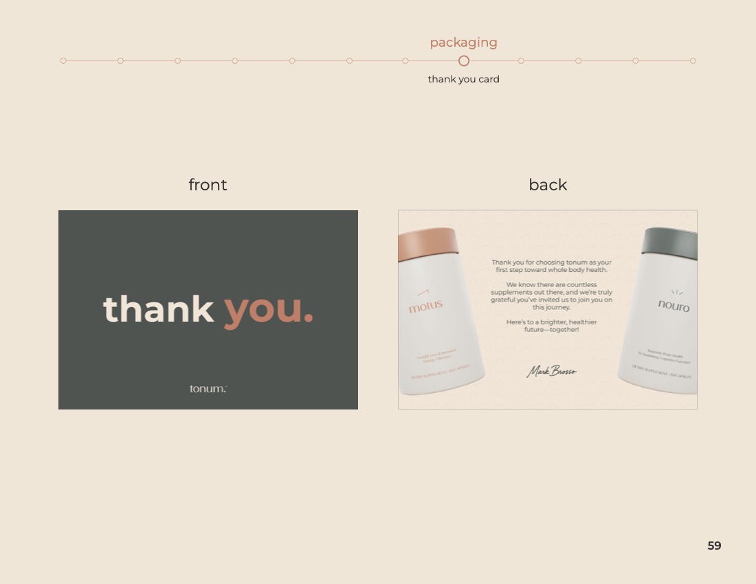
Tonum brand book cover

Results

Post-launch engagement grew month over month as the identity rolled out across surfaces. The system now runs a twelve-person creative team — the guidelines carry the brand without my direct involvement.

03 Motus Electrolytes

Motus Lyte

Three flavors of an electrolyte version of Tonum's weight loss product, in a minimalist visual system — Peach, Mango, and Orange Raspberry.

04 Tonum Launch

Launch Campaign

A cross-platform story that introduced our brand — and started the conversation.

Brief

A cross-channel launch built around a single, simple gesture that translates across digital, print, OOH, and social with no loss of fidelity. One idea, many surfaces.

Insight

One theme, one idea, one hundred surfaces. The work scales because the idea is small enough to carry everywhere.

Results

Placeholder for results and recognition.

Chris is a creative director working at the intersection of brand identity and cultural advertising — building systems that hold a company together and campaigns that pull it forward.

Trained in design before moving to advertising, Chris leads from the craft up. The work spans launches, repositionings, and integrated campaigns for legacy brands and challengers alike. The thread between them is conviction: a clear point of view, expressed with restraint and confidence.

Currently open to staff and consulting roles. Always open to a conversation about what a brand could be, and the work it would take to get there.